Analyze
This gamified eLearning challenge is a conceptual project excerpt designed to raise awareness for college students.
Audience: college students
Responsibilities: instructional design (action mapping, storyboarding, prototype, full build), visual design, eLearning development
Resources & Tools Used: Articulate Storyline 360, Adobe Photoshop, Adobe Illustrator, PowerPoint, Google Docs, Pexels
the idea
During my first year at the college, I witnessed many people leave the water running if the taps were not touchless models. I asked my classmates a crucial question:
“Can you guess the percentage of fresh water and how much of it can be used by humans and living things?”
Unfortunately, all the answers were too far from the fact and I wanted to be part of the solution. I transformed Articulate’s eLearning Heroes challenge into a small project.
- Objective: By the end of this game, college students will be able to practice turning off the tap immediately after use during simulated activities.
College students are the participants in the game.
Students will regularly practice turning off the tap after each use.
In the context of game simulations that replicate water usage scenarios by fetching the water from the well.
After each use, without fail
Students should practice turning off the tap every time without any reminders.
design
Process
Preparation of the instructional content by using scholarly resources after consulting SMEs.
(SMEs = Former Science Teachers in the class)
Relying on gamification as the instructional strategy
Offering a water well to remind the learners how hard it was to get water and helping them make connections with the past.
Collecting copyright-free animated gifs to create an immersive visual
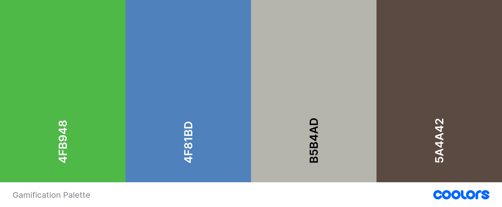
Employing the right color palette and creating the necessary background and the dial skin with Adobe Creative Suite
S Sharing a prototype created using Articulate Storyline 360
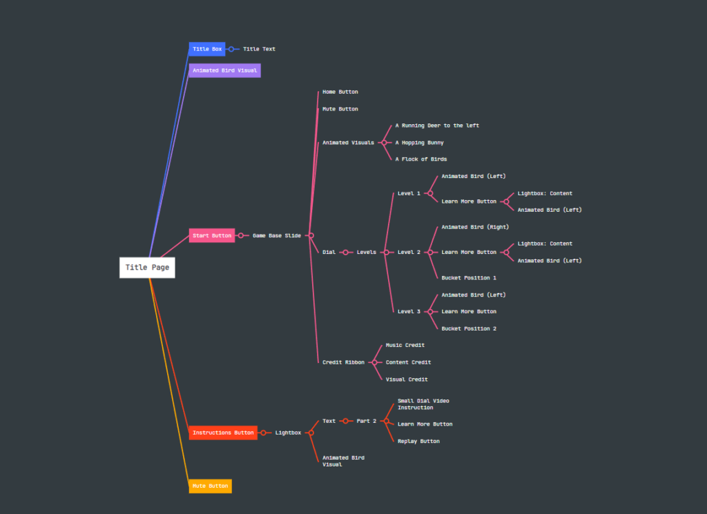
Visual storyboarding
development
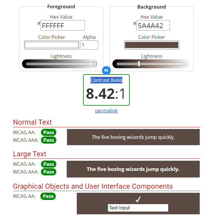
I took steps to make sure that the buttons’ foreground and background colours and the instructional content’s colour contrast met the AODA minimum requirement of 4.5:1 before combining all the parts.
To enhance the accessibility and interaction, I worked on the focus order and tested the keys such as tab and arrows.
Since the text and audio are identical and there is no additional video content with voiceover, I did not include closed captions.
Select each picture to view a larger version.
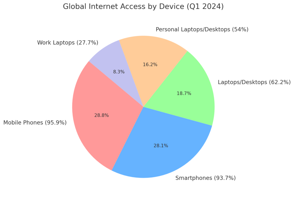
According to data from Statista.com, over half of users access the internet via mobile devices. With this in mind, a Mobile-First Design approach should be our top priority.
Selecting the right font size and typeface is equally important, as each typeface can appear differently in size across screens.
Select each picture to view a larger version.
In the prototype, students testing the dial navigation element found it difficult to understand, so I added a brief instructional video.
implementation
During the implementation stage, I simulated the process by having students test the content and provide feedback. Afterward, their comments were valuable for the evaluation phase.
To practice my LMS management skills, I exported the content as a SCORM package for testing.
Select each picture to view a larger version.
evaluation
Pilot Testing Results: Based on initial pilot testing data, I would avoid using dials and opt for a mobile-friendly navigation system instead.
Learner Performance Analysis: To assess the course’s effectiveness, I would analyze water consumption data to determine if learners are meeting the learning objectives and identify any gaps in understanding.
reference
Petrosyan, Ani . “Share of Users Worldwide Accessing the Internet in 1st Quarter 2024, by Device.” Statista,
July 2024, www.statista.com/statistics/1289755/internet-access-by-device-worldwide/#statisticContainer. Accessed 22 Sept. 2024.


