Is it getting better?
I started feeling more confident about my HTML and CSS and tried to use some responsive elements.
First I realized that I needed the viewport in the meta section of my code.
<meta name="viewport" content="width=device-width, initial-scale=1">
Hey <div>! You are not old school, do not get mad.
Without <div> and classes, it was impossible to make things move around or I am not there yet. I have always wondered how people make those beautiful small boxes with lovely content. I can also make it work 😍😍😍
JavaScript: Still I have no clue…
While doing the assignment, changing the size of the boxes by using different percentages was easy; however, My JavaScript still needs some work.
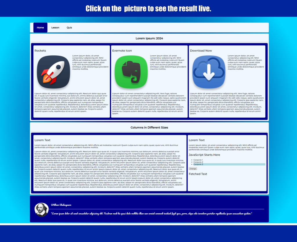
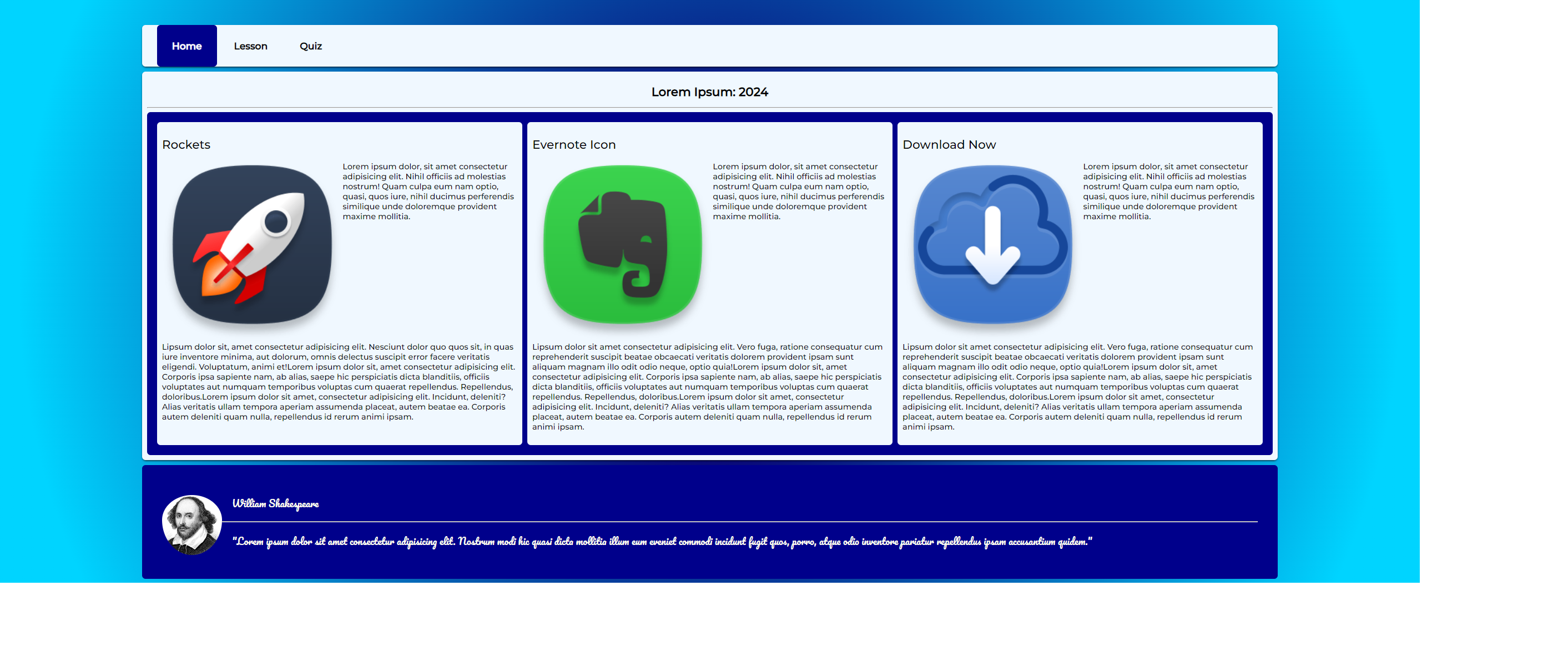
This is the final result:
After using the validator, I felt my code worked flawlessly.